Let’s get off to a good start this week with the Wall Street Journal, who are now regularly producing interactive applications, catching up with leaders in the field such as the Guardian and The New York Times.
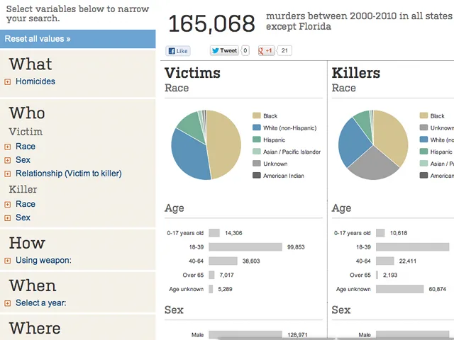
The application Murder in America allows the user to “explore an interactive database of killings committed in the US from 2000 to 2010“. Refining your search is easy, using the criteria that appear in accounts compiled by the FBI: “race” – in the sense that this word is used in the US; the sex of the murderer or victim; the circumstances of the murder; geographical location; type of weapon, etc. The complex task is carried out in a manner that is understated and simple to use, always a useful measure to assess the quality of such a project.

Ou est le supermarché?
Slightly less ambitious but refreshing all the same, this untitled application, made by our French comrades at Data Publica, showcases their know-how and technological capability for visualising data. It also sends a positive message to the private sector that “open data” can mean more than just “public data”, encouraging private companies to open up their data wherever possible.

The application locates supermarkets in Paris, displaying quantity per 10,000 residents. You can play with the full version here.
The crowdsourced project Bostonography operates under a simple principle: define the neighbourhoods of Boston (Massachusetts) by asking residents to draw the boundaries of their neighbourhoods as they perceive them. The idea might seem silly, but the results prove otherwise: not everyone has the same perception of space and territory. The project aims to take each interpretation into account and highlight points of agreement, in order to best identify the “real” heart of a neighbourhood.


Great British Bands
This small unpretentious infographic was created by Pello, a “London artist combining a love of music with a desire for creativity”. His methodology in short: map “British” singers and groups according to their place of birth or training.

À l’est, du nouveau
Over the summer we spotted this short video from The Economist, which carries out some historico-politico-socio-geographical fact-checking. The video gives the lie to the concept of “Eastern Europe” and why “counting the ex-communist countries as a single category is outdated and damaging“. The explanations are clear: it’s not justified to group these countries together for geographical, economic or political reasons. Here at The Week In Data, we’re advocates of a “Danubian Europe” – which at least makes sense historically and culturally – or even a “Roman Europe.”
French football in data
We draw your attention once again to Anthony Veyssiere because, to be honest, we love everything he does. Having covered elections and Twitter, and OECD data, the young designer-developer has now published a remarkable visualisation focusing on French football, based on statistical data from a specialist in the sector, Transfermarkt.
The visualisation graphically displays the various players of the French Ligue 1 on a radar chart according to their role in their respective teams. It’s easy to see at a glance the financial disparities among French football clubs and their “strengths” and “weaknesses” in each area. Obviously, the conclusion to all this is that the richest clubs are not always the best. The application will likely delight fans of Championship Manager and similar games with its playful look and feel.

The truth is out there
Our final infographic comes from xkcd, and represents the 786 exoplanets known to date, placed in scale with our own solar system. The good news is that we are discovering more and more of these exoplanets, and they draw closer within our reach due to advances in technology. But for now we know absolutely nothing about these distant celestial bodies.

Have a great data-week everyone!
Find previous editions of The Week In Data on Owni.eu
Follow Owni’s elite data squadron: Twitter | Facebook | Pinterest
💬 Discussion
No comments yet. Be the first to comment!