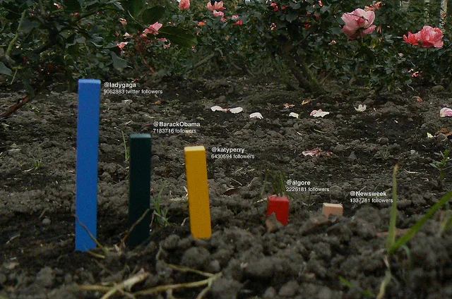
Jose Duarte, a 27 year-old graphic designer made his own data visualisation kit which are both ingenious and entertaining. Jose explains how he came up with the idea:
It’s a statement about the saturation of the digital: there is a desire to solve everything with computers, but we have not always had the ability to make charts to clarify an idea or concept. However, we’ve always had pencils, markers and everyday objects. I thought, why not make a graph with my shoelaces?

Jose is also the co-founder of Ledfish[SP], which offers data visualisations to businesses. In the digital age, this kit allows a more handmade touch to projects – but not without leaving some people perplexed, according to Jose.
“People often ask me how to be precise in graphics by hand. My response is while it’s important to be precise in the proportions, it’s more critical the idea is clear. A good example is the visualizations I’ve done with the kit:

It’s evident that the increase in Internet users between 2000 and 2010 was extreme – that’s the main idea behind this visualization. Rather than limit myself to giving numbers each year, I inflate the balloon. I know this is not the most precise way to make a graph. (I like) how the ball, in an abstract form, represents a tangible idea.”
He concludes:
It’s a way for me to materialize information, and that’s where the idea to create this tool to help me achieve my objective was born.
Hand Made Data Kit by © José Duarte

💬 Discussion
No comments yet. Be the first to comment!