Over the last eighteen months, we’ve seen an explosion in open data legislation in Europe, including Helsinki, Paris, Munich, Manchester and the Basque territory. Pushed by European Parliament directives and increasing civilian interest (evident by Regards Citoyen and Datapublica), governments and cities are following the trend of putting all sorts of data online.
To liberate (well, a little) data is one thing, but how do citizens benefit? If the movement has begun on the administrative side, then there is still the issue of sensitizing the public at large to open data’s opportunities and importance. How do you bring data to life? How do you free gigabytes of languishing data from CSV tables?
Digital tools to make data speak
Like Simon Rogers from the Guardian underlines, tons of free software exists that anyone can use to easily generate visualizations and data: Google Charts, Google Fusion Tables, Many Eyes, and Timetric. However, most citizens have neither the time nor means to decipher raw data sets, or dismantle an Excel table with 5,000 cell. This deluge of data offers not social opportunities, but economic ones in inventing digital tools that render such data intelligible, useful and accessible. Developers, graphic artists, and journalists acting in harmony to make data sets a valuable information source has transformed data into a tool for liberation and reflection.
The Open Data Challenge marks a symbolic step in this new field of research. This European competition (led by the Open Knowledge Foundation, sponsored by Simon Rogers, Tim Berners-Lee, Google, IBM, and Microsoft) consisted of 430 participants from 24 different European Union countries, who within a two-month period submitted their data-liberating tools for the average citizen.
A prize of 20,000 euros was given to the most innovating crowdsourcing platforms or data visualization applicable to everyone’s daily life. Here’s a list of the winners.
“Who makes business with the State?” from Zasichdani.sk took home first prize in the applications category with its simple interface that reveals the public figures behind each signed Slovakian government contract – clearly showing conflicts of interest and reasons to worry about corruption. Despite a copyright license, the development of such applied open data tools is an opportunity to demand government transparency.
On the same wavelength is Open Corporate’s “The open database of the corporate world,” which is a worldwide crowdsourcing platform that uses scraping tools to establish and understand connections between governments and businesses.
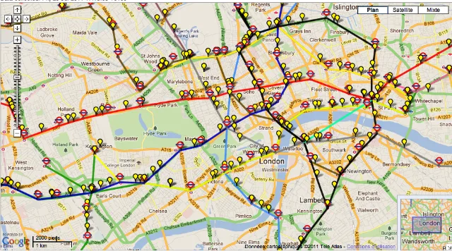
In the “augmented” everyday category, take a look at “Live London Underground Tube Map,” an application that instantly indicates the exact position of every London metro train on the network. The application allows the user to know traffic conditions in real time, allowing them to modify their route according to accidents, closed stations, or simple congestion. A great idea, but it can’t be applied everywhere just yet; Paris’ RATP blocks access to its data, for example.[FR]

Another data visualization application, “Bike Share Map” (UK), is available in thirty cities worldwide and allows the user to see where every bike terminal is located and the number of parked bikes in real time. Paris is again the odd one out, as the city’s Vélib data is also blocked.

Still in the public transport category: Manchester’s “augmented” bus schedules.

The Open Knowledge Foundation selected a Danish application that takes advantage of the numerous recent releases of European data. It creates visualizations of all the legislative activity since 1950 in the European Union. Ranging from subjects such as health, transport, nuclear policy, and culture, the app effectively displays the decisions and policy developments in the EU.

On a more local level, the Dutch application Politiek Inzicht visualizes the “trending topics” in each parliament member’s reports and propositions over an extended period of time. This allows citizens to view the evolution of their politicians speeches and positions.
This application maps CO2 emissions in Europe by geolocalizing factories and power plants. Another “offset map” shows where European companies buy their “carbon offsets” in the world.

All these promising applications can be viewed on publicdata.eu
💬 Discussion
No comments yet. Be the first to comment!