We’ve all been amazed, at one time or another, by pictures of Earth as seen from space. Particularly amazing are those images that allow us make out the contours of our continents by the lights of our megacities at night. Born of human beings’ domination and influence over their environment, this glittering vision of the world is part of the anthropocene. It inspired the Canadian anthropologist Felix Pharand-Deschenes of the Globaia.org site to create some magnificent visualizations of Earth using public data: cities, roads, railways, airlines, power lines, Internet cables…
Moved by our moving
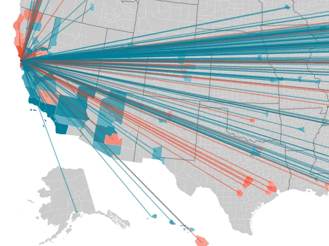
The mobility of Americans is legendary. Last year, nearly 40 million of them moved house, 10% of those moving from one state to another. Forbes journalist Jon Bruner took data from the IRS (Internal Revenue Service) to create an interactive map of county by county migration flows between 2005 and 2009. Apart from being simple, pretty and informative, the map is a remarkably fun way to deepen your knowledge of the geography of the United States.

The classy House Hunting, created by the real estate site Trulia, is a useful tool if you are moving house. It demonstrates what can be achieved with the opening up of its own data – even from a private company. Here, by analyzing traffic to its website and its mobile application between June and August 2011, Trulia managed to generate a clear and nicely graded visualization – day after day and hour by hour – of Internet users’ real estate searches. If your cerebrum is working well enough to make a mash-up with the previously mentioned site, you can even have fun confirming (or not) the coefficient of US citizens’ wanderlust.

Sticking with US data, here’s a small app from The Atlantic Cities. Created using data from the Department of Labor and a consumer survey carried out by real estate site Zillow.com, this lightweight application provides an instantaneous snapshot of data from major US cities according to nine basic indicators of population, housing, education and tourism. While it’s fairly mediocre, and it’s not going to bring home any prizes for design, you might find this little site useful.

“No money, no Swiss.” – Racine
As a faithful reader of OWNI you’ll be aware that we are closely monitoring the Occupy Wall Street movement. This week, that global movement encountered two major players in the field of data. First, the New York Times published Public Opinion and the Occupy Movement. This was the graphical result of a recent survey of the general public conducted in collaboration with CBS News, to collect their feelings about the demands and methods of the protesters. The web application (in HTML5) reproducing the survey shows at a glance the cross reference of question and answer using coloured panels. Each statement is represented by a coloured dot in it’s relevant panel. Simply hover over the dots to read each full statement.

The Guardian is also no stranger to masterful demonstrations. Some soberly displayed figures remind us of the reality of the important economic facts in the United States – the disparity of wealth and income, and the evolution of that disparity – and offers a subtle and thorough reading of the origins of the global ‘We are the 99%’ movement. In truth, the slogan should be “we are the 99.99%”. While it’s hard to perceive from the facts, the pressure is building thanks to the data, which accompanies the social upheaval that we are witnessing or participating in to varying degrees.

Of similar interest is Drawing Lines Between Billionaires and Politicians, designed and edited by Jon Bruner who we mentioned earlier. After spending some of his summer breaking down and analyzing the records of the Federal Election Commission (FEC), he created a model of the relationship between the richest – including the famous 0.01% mentioned in the Guardian’s video – and political action committees (PACs), private organizations responsible for fundraising for political parties. The graphic is undeniably very “data heavy”, and doesn’t compare well with the dataviz produced last year by Bruner which we also suggest you play around with.

Staying a little longer with business: you may remember the NYT visualization “It’s all connected” about the interdependence of states’ debt. This week, the BBC dug deep into their bag of tricks to produce their own visualization. This little app seems even better than the celebrated team in New York’s effort: more sober and aesthetically superior, it pays homage to the adage that “Less is More”. Simple and effective.

“Ces gens-là ne font pas de manières (These people don’t put on airs)” – ‘Loir-et-Cher’, Michel Delpech
We can’t go without mentioning open data. Little cited in the various maps of Open Data in France – including that of LiberTIC which we encourage you to support – the department of Loir-et-Cher has made available its platform of land information: Pilote41. A central question these days, at the heart of the democratic regeneration process which could be a central focus of the upcoming French presidential election, the opening of data continues to make progress in every corner of France. Although many improvements are still needed, as underlined by the Director of the Fondation pour la Recherche sur les Administrations et les Politiques Publiques (iFRAP) during the second Assises de l’évaluation des politiques publiques. Meanwhile on the iFRAP website Agnès Verdier-Molinié has drawn up an exhaustive list of “essential and improperly unpublished data”. Well worth a look.
To conclude this third installment of The Week in Data, we feel we owe it to our talented readers to point them towards the second visualization challenge being run by Information is Beautiful. There’s no less than $5000 in prizes available, and the theme is “MON€Y PANIC$!”. Good luck!

IIB Awards
Image Credits: Globaia.org
Follow OWNI’s elite data squadron on Twitter: @pdatha, @mariecoussin, @juliengoetz, @nicolaspatte & @gregoirenormand
Find previous editions of The Week in Data!
💬 Discussion
No comments yet. Be the first to comment!