We begin our data journey this week in the unfamiliar destination of Afghanistan.
For seven years The Asia Foundation have been carrying out opinion polling on the Afghan population, regarding their perception of the political changes and developments that have taken place in their daily lives. In 2011, they interviewed 6,348 Afghan citizens living throughout the 34 provinces of the country.
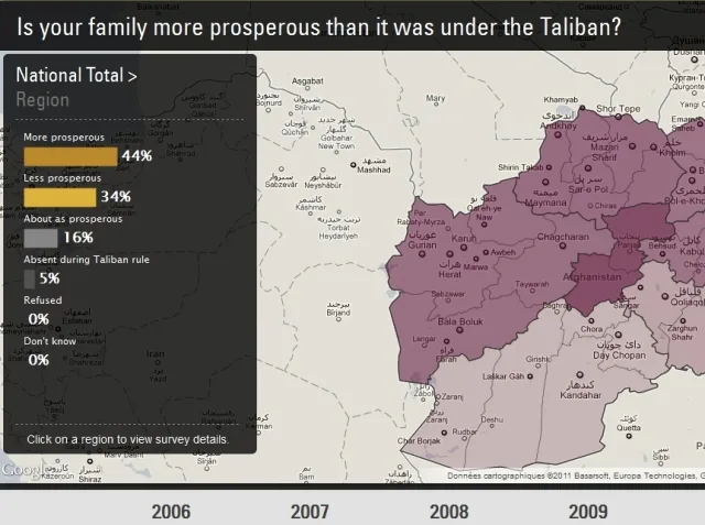
The interactive application Visualizing Afghanistan allows the user to navigate through the results of this study in three ways: chronologically (from 2006 to 2011), by topic (the user can select the questions in the upper right-hand corner) and using the map, by accessing the detailed responses by region.
There is a depth to the application that’s particularly revealing and useful in putting the data into perspective. So to the question, “Does your family live better today than when the Taliban were in power?”, the answer is mixed in the South (33% no, 34% yes), while the central region (Hazarjat) is more unanimous – 67% say they live better now than under the Taliban.

Open Data, Singapore style
Staying in Asia we head to Singapore next, where a number of organisations, including the SENSEable City Lab at MIT (Massachusetts Institute of Technology), now have accumulated nearly enough data on the daily lives of citizens to improve their knowledge of the best ways to get around their city. People tend to rely on mostly static data when planning their journeys, far removed from the reality of the information they actually need.
“Think about the inconsistency of printed transport timetables, static opening hours, driving to stores to find a product out of stock,” they remind us, and rightly so.
Dynamic and real time data is the bedrock of their LIVE Singapore! project. They explore several very promising areas (isochronic representation, crossover data between the availability of taxis and the weather, etc.).. The only downside is their site features a video combining the six projects to date, but doesn’t allow the user to navigate each project individually.
Eventually, LIVE Singapore! aims to provide a platform where developers and citizens can work with new ideas linked to a flexible and accessible API and to new data visualization techniques. Does that remind you of anything? Read their project description: “…providing people with access to a range of useful real-time information about their city by developing an open platform for the collection, elaboration and distribution of real-time data that reflect urban activity. Giving people visual and tangible access to real-time information about their city enables them to take their decisions more in sync with their environment, with what is actually happening around them.”
In other words … they’re opening up the data.

Open Sourcing Respect
Geolocalisation, crowdsourcing and data were in the news last week, when the story broke that two journalists had been victims of sexual assault in Egypt while covering events in Tahrir Square.
Those events helped to reveal the extent of the problem of the harassment of women, which has become a real scourge in Egypt. According to The Egyptian Center for Women’s Rights (ECWR), 83% of Egyptian women and 98% of foreign women are harassed in Egypt.
Harass Map allows women to anonymously report incidents where they have been the victim of sexual assault. There are four methods of reporting such incidents: by SMS, by Twitter, by mail or using a form on the site. The site then aggregates on a map the various reports.
The platform was developed by Ushahidi, who specialize in the production of open source software and platforms for crowdsourcing and geolocalisation. They previously created a platform after the earthquake in Haiti to help pinpoint areas in need of assistance. The SMS system uses Frontline SMS, another open source project that allows citizens and NGO’s to send free SMS messages from anywhere in the world as long as there is a mobile signal.

The project intends on reinvesting the SMS revenue into initiatives to fight against the harassment of women.
The art of data
We’re a little ashamed to admit that only this week we discovered the DataArt site, which has apparently been around since 2009. It collects together various experiments carried out by the BBC and the Guardian.
It aims to show that the boundaries between art and information are now blurred; to give the keys to a public that’s both expert and non-expert to learn about these new forms of representing information; to present projects and to motivate the public to get into data. For this reason alone a site like this deserves a place in our round-up, despite their committing the original sin of only developing it in flash…
Each of the projects presented on the site would require a paragraph each. As a little example, we suggest you take a look at the NewsCloud. Available for all BBC and Guardian media since 2000, this application allows the user to enter a keyword (e.g. DNA in the image below) and then to visualize the different words that were used in the two organisations media coverage of that keyword. Fluid and intuitive navigation with rich content.

A marathon with no running
Let’s not leave those talented Brits just yet. Last November 12-13 the Visualizing Marathon took place, organized by General Electric with support from Google. The goal: from a data set (here, the results of a survey on the feelings of Britons about the next Olympic Games), work 24 hours non-stop to create a visualization, interactive or not.
12 teams were involved, including a team made up of four French students from the Nantes School of Design (l’école de design de Nantes): Maxime Fabas, Thomas Dupeyrat, Ian Ardouin-Fumat and Maxime Leroy.
Maxime tells us about her experience:
We decided to set up an interactive application, in Processing, linking the emotions of the British people with their interest (or lack thereof) for the upcoming Olympic Games. Indeed, on going through the data set, we noticed that nearly 25% of respondents had neither a positive nor a negative opinion of the Games. As the general theme of Marathon was “Get The Most From The Olympic Games”, it seemed interesting for us to focus on that 25% who appeared to still be unconvinced about the Games.
We had six hours to explore and work on the database. Then we split into two pairs, one for the design of the interface, one for the code, and we worked for a good ten hours. When we got cracking on the interactive aspect, we were a bit tight for time and realised our product was not quite ready. But the experience was truly outstanding: there was a great atmosphere, we learned a lot by watching others and of course the introduction by David McCandless was exciting.
You can view the application made by Maxime and her friends here, along with all the projects completed during the Marathon.

The students from Nantes will be able to put to use what they learned quickly back at home, as the agglomeration community and the city of Nantes last week launched their own Open Data portal: data.nantes.fr
A dataviz to keep in the toolbox
At last, the infographic takes its place in your kitchen. Conceived by PartSelect, a company that sells parts online and that has a special “passion for DIY”, this interactive infographic aims to help you determine, when an appliance has a problem, is it more cost effective to buy a new one or to repair it?
The infographic presents two types of problem per appliance, and suggests the potential cause or causes, the ease of repair (on a score of 1 to 5), the cost of repair (with a color code from most to least expensive) and finally how much equipment is involved. Would have pleased the wife in the 60’s.

“Money for nothing”
No matter how closely you follow the world of data, you can’t have failed to see this ENORMOUS INFOGRAPHIC, simply entitled “Money”. Enormous in size, enormous in the amount of data involved, and enormous in ambition: “A chart of (almost) all of it, where it is and what it can do”.
Impressive indeed, but it seemed to us that the huge size of this graphic was achieved at the expense of relevance and readability. Dividing it into chapters that were then all inserted into a web app would surely have done greater justice to the considerable work done on the data.

Political Tracking
One last one for the road, take a look at this Poll Tracker produced by USA Today which portrays the Republican Primary race.
![]()
Follow OWNI’s elite data squadron on Twitter: @pdatha, @gregoirenormand, @mariecoussin, @juliengoetz & @nicolaspatte
Find previous editions of The Week in Data!
💬 Discussion
No comments yet. Be the first to comment!