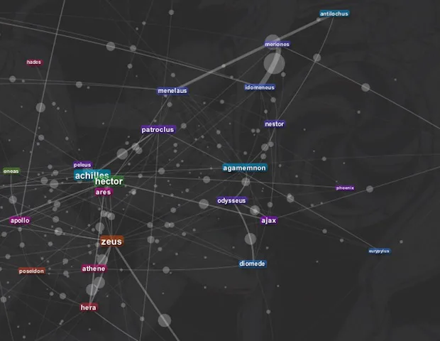
Santiago Ortiz’s magical project, available on his website moebio.com, invites you to discover a text that’s more than 3,000 years old from a completely new angle. He’s created two interactive datavizualisations of Homer’s Iliad. The “stream” version allows the user to observe who are the most prevalent characters throughout the work, while the “network” version visualises the relationships between the characters.
Each character, represented by a rectangle, is connected to the other characters they interact with during the Iliad. The more a character appears and interacts with other characters, the greater his impact in the visualisation.
From now on Achilles, Hector and Zeus will have to watch out for their online reputations.

The nuclear effects
Not for the faint of heart this one. Alex Wellerstein, a historian specialising in nuclear weapons and working at the American Institute of Physics, has built a map around a somewhat politically incorrect idea.
The aptly named Nukemap – the name “Alex’s Nuclear Effects Calculator” was deemed insufficiently sexy by Alex’s friends – allows the user to detonate a nuclear bomb of their choice, in a location of their choice, and then visualises the effects produced.

Alex Wellerstein has denied accusations that the project is overly morbid, or indeed an incitement to terrorism. It’s mainly for research purposes, he claims, and was created as part of a course he took on the history of nuclear weapons. Using the map, we can compare the power of the very first nuclear bombs with those that have been developed today.
By March of this year the tool had been used more than three million times, by 190,000 visitors. Alex drew up another map displaying the most popular locations chosen by users to detonate their bombs – Europe and the US are over-represented.

I love DataViz-Democracy
Another #oldlink but one we really wanted to include is the application developed by the French start-up Dataveyes for the TV network Arte, to coincide with the launch of the documentary series “I love Democracy“.
The application presents portraits of seven countries – the United States, Morocco, Tunisia, Greece, Turkey, Russia and India – according to six indicators summarised in a dataviz: longevity of the head of state; democratic situation; education; inequality between men and women; Facebook and Internet use; and wealth inequality. Alongside a summary table, the user can also compare these seven leading countries with other nations around the world.
More than the data itself, it’s the look of the datavizualisations, graphics and navigation selected that make the application stand out from the rest. The only downside: the comparison of the democratic situations in each country is a little unclear.

Analysing ‘La Présidentielle’
Two apps focusing on the French presidential elections particularly caught our attention in recent weeks.
The most recent, launched by Data Publica in partnership with Matière Primaire, allows the user to observe the candidates on Twitter according to several variables. Those include their number of followers; semantics – the words that occur most frequently in tweets that refer to a candidate over a given period of time (either a month, a week or the last 24 hours); and noise – the number of tweets related to each candidate.
Based on Twitter’s search API, the application is updated every 30 minutes and retrieves up to 1,500 tweets per candidate.
This relatively comprehensive database, well served by the distinctive and minimalist design of Matiere, makes for a user-friendly and useful tool.

Less recent but still topical is an application that analyses the speeches of the presidential candidates developed by Linkfluence and Jean Veronis Technologies for LeMonde.fr.
A semantic tool, it provides computer analysis of over 1,100 political speeches (only public speeches) with the ability to go deep into the topics: filtering speeches by candidate, choosing topics, selecting speeches from a certain timeframe (using the timeline), comparing the presence of pronouns and particularly visualising the most prevalent themes in each speech.
All it’s missing is a function for comparing the speeches of different candidates. Maybe for 2017?

Red Square in open data
Russia meets data journalism: that’s the hope at least of the team of journalists and citizens who’ve started the site datajournalism.ru. The site, which is visually very strong, hopes to:
- set up a round-up on data journalism (with many links to the Guardian Datablog) and to encourage the creation of a school of data journalism in Russia;
- bring together journalists, developers and designers to build projects
- promote open data in Russia (best of luck with that one) and publish data that is already open.
There’s also a competitive goal to all this: datajournalism.ru hopes to present itself as a candidate for the first Data Journalism Awards organised by the GEN (Global Editor’s Network), Google and the European Journalism Centre (EJC).

Speaking of open data, here’s a real time map of train delays from Germany. No need to comment, just sit back and admire.

Top up your data-toolbox
We end this edition of The Week in Data with two very practical data journalism initiatives. The first is one to watch: the recent announcement from Wikipedia regarding the creation of Wikidata, a free, collaborative, multilingual database facilitating the collection of structured data.
The second is something you can use right now. Datawrapper.de is free, online datavisualisation tool developed by the data journalists Nicolas Kayser-Bril and Mirko Lorenz for ABVZ – a journalist training organisation affiliated with BDVZ (the Federation of German Newspaper Publishers). Much like Google Charts or Many Eyes, Datawrapper allows the user to create easily embeddable graphics and visualisations on its site.
Have a great data-week everyone!
Follow OWNI’s elite data squadron on Twitter: @pdatha, @mariecoussin, @juliengoetz, @nicolaspatte & @gregoirenormand
💬 Discussion
No comments yet. Be the first to comment!