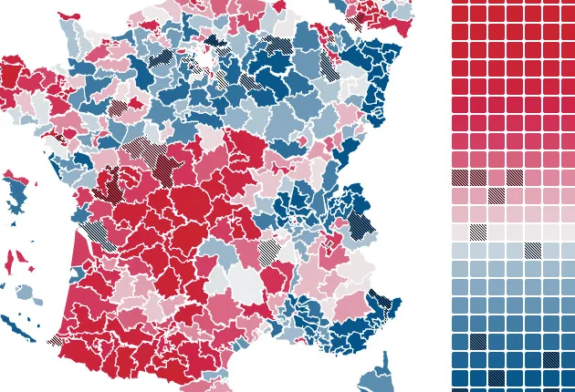
Let’s get straight into it this week with a data visualisation focusing on the parliamentary elections in France, the second round of which took place this past Sunday. It comes from one of the OECD’s data designers, Jérôme Cukier, someone who is becoming a regular feature in our weekly data round-up. After playing around with the D3.js library, he ended up coding an interactive map which visualises projected results of the election, district by district.

The calculations were made on the basis of results from the second round of May’s presidential election, and the data can be searched via an ergonomically disconcerting interface.
Firstly, each district is coloured a shade of pink or blue depending on the likely outcomes. Secondly, a series of 577 squares represent every district using the same colour code. This grid can even be organised into two types of classification: geographical (from Ain to French nationals living abroad) or political (from dark pink to blue). Best of all, constituencies featuring either former or current ministers, or a representative who was close to the recently evicted president Nicolas Sarkozy, are marked out with a hatched pattern.
Cultural bubbles
A freelance journalist, photojournalism buff and the brains behind the excellent visual review Oeil du Viseur, Jean Abbiateci is not afraid to get his hands dirty with code and recently he too has been having a lot of fun with d3.js. His latest project tackles an area often overlooked by the data world: that of the cultural sector. It’s a welcome breath of fresh air amongst the pervasiveness of serious political-economic data.
A few weeks ago, while French Twitter users excitedly debated the state of the weather over the Croisette at the Cannes Film Festival, Jean Abbiateci quietly released a very useful visualisation, aptly entitled Box Office: Cinema in France.
It allows the user to browse box office results from 2007 to 2011. Two particularly good ideas make this data visualisation stand out from the rest. The first: assigning easily identifiable colour codes to films present and/or honoured at Cannes. The second: proposing some well-chosen filters (genre, public/ media reaction, country).

Searching through the presented data we discovered some interesting information. For example, in four of the last five years, the Palme d’Or has gone to a drama (the Croisette is full of happy people!) and those winners are consistently rated higher by critics than by the public (the Croisette is magnanimous!).
Jean Abbiateci continued with his bubble theme to visualise the art market in Art and Money. This time it’s the 270 most valuable works sold at auction between 2008 and 2011 which are presented.
Here again, browsing through the data is a breeze: four colours for the type of works (drawing, painting, screen printing, sculpture) and no less than 10 filters to show us the various aspects of this data. Why complicate things when you can do them simply?

Data trains
Shame on those who think that France isn’t abounding with resources for working with data (as we already noted during the GoogleViz contest last winter). However, it seems that French rail operator SNCF is not aware of this fact. To explore its data on rail usage in France, the company chose to work with researchers overseas. We’ll excuse it in this instance, however, as it was with MIT and specifically the SENSEable City Lab.
Trains of Data offers two approaches to the numbers. The first is an isochronic vision of journey time between two stations. Time to update the geography textbooks.
Second angle: what is the breakdown of train delays around the country? Not just each station’s internal clock is on show, but also the number of passengers affected by any delay. The points representing each train are wider or narrower depending on the number of passengers they transport.
Data-nimbus
We finish this episode of The Week in Data with Point Cloud, a crazy project from James Leng.
In his own words:
This project is an attempt to reimagine our daily interaction with weather data. Instead of displaying static values of temperature, humidity, or precipitation, Point Cloud performs the data, dynamically shifting between stability and turbulence, expansion and contraction.
That might seem obscure and abstract, and partly it is. But it pushes us to question how we visualise this data that has been studied for centuries and which still continues to elude us somehow: the weather. James Leng’s response involves a few Arduino processors, 100 metres of cable and 966 joining points. Fun and zen.
Finally, because behind every great data visualisation there is code, and because code is also art, take a wander here and there. Have a good week.

Find previous editions of The Week In Data on Owni.eu
Follow OWNI’s elite data squadron on Twitter: @pdatha, @mariecoussin, @juliengoetz & @nicolaspatte
💬 Discussion
No comments yet. Be the first to comment!