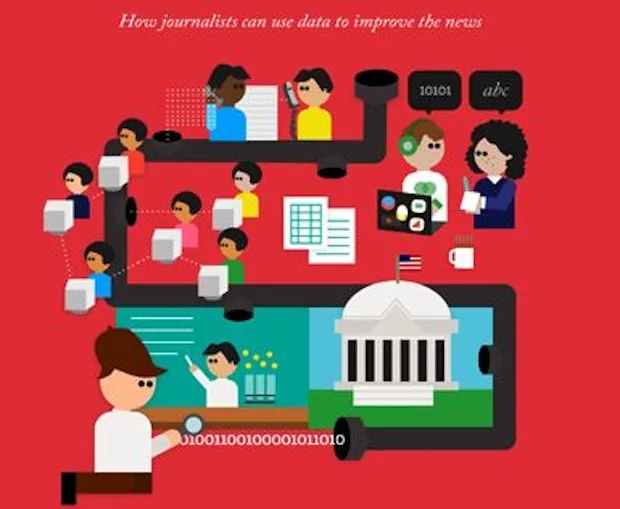
Since last weekend, OWNI’s data team has been a little emotional: our Bible has been launched. It’s red, it’s pretty and it’s called the Data Journalism Handbook. It has many parents: the idea was conceived by the European Journalism Centre and the Open Knowledge Foundation, and features contributions from the BBC, the Chicago Tribune, the Guardian, ProPublica, La Nacion and The Washington Post among many others.

What we particularly like about the handbook is that the content is based on practical trial and feedback, already trying to take a step back from this “new”, evolving practice that is data journalism. For example, the “In The Newsroom” section shows that data journalism arrived by different means into various newsroom; into ABC through multi-platform projects, into the Chicago Tribune by integrating hackers.
Paul Bradshaw of the University of Birmingham ends the page devoted to the definition of data journalism with these sentences, which seemed worth noting to us:
Data can be the source of data journalism, or it can be the tool with which the story is told — or it can be both. Like any source, it should be treated with scepticism; and like any tool, we should be conscious of how it can shape and restrict the stories that are created with it.
The paper and ebook version of the Data Journalism Handbook is published by O’Reilly, while a free online version is available here.
Show business
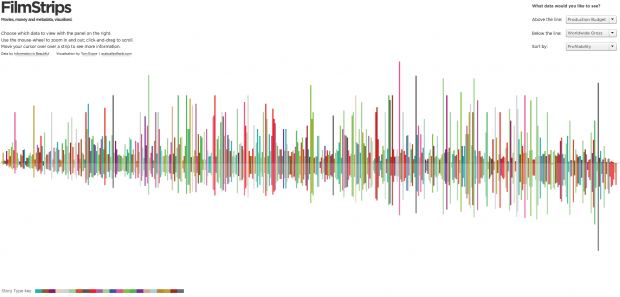
What was the box office for the film Drive? How profitable was Black Swan? Which got the bigger audience, Slumdog Millionaire or Gran Torino?
The remarkable interactive infographic by Tom Evans (nice Twitter profile pic) entitled Film Stripes, and hosted by Visual.ly, compares films according to several criteria: production budget, box office, rating, and profitability. We learned that Paranormal Activity is the top ranking movie with a 1,142,000% profitability rate: a $15,ooo budget film that took in $171.3 million.
The site offers an aesthetic and financial vision of the US cinema economy. One small problem, however: the infographic doesn’t specify according to what criteria (year, nationality…) the films were selected.
Plot twists
The magazine Delayed Gratification, published by ‘The Slow Journalism Company’, was interested in the themes present in the list of selected works for the 2011 Booker Price, one of the most important literary prizes awarded to fiction novels written in English by an author living as a citizen of the Commonwealth, Ireland, Pakistan or South Africa.
Plot Lines lists twenty themes. Some are present in just a single book, such as “tiger escaped” or “murder of cowboy brothers”; and others more widely shared – “love”, “death”, “war”.

We also like the concept that underpins ‘The Slow Journalism Company’:
Slow Journalism measures news in months not minutes, returning to stories after the dust has settled. The Slow Journalism Company offers an antidote to throwaway media and makes a virtue of being the last to breaking news. Its publications are beautiful, collectible and designed to be treasured.
Its infographic archives contain some gems, both in terms of ideas and finished product. “The True Meaning of Christmas“, for example, based on Google searches, or “The Month in Twitter“, which geo-tags Twitter exchanges.
Nuclear Vision
This application may be an #oldlink, but we figured it richly deserves a place in our data round-up anyway.
FaceNuke, produced by Greenpeace, maps relationships in the energy sector in France. Each dot represents a personality and with one click, the list of persons to whom the “dot” is connected appears, grouped according to their parent organisation (Areva, EDF, UMP, etc..)
The clincher: the database used in the application is available in spreadsheet format from the ‘More’ tab.
The downer: the links between people are not qualified.

Les DataViz
If you’re heading to France any time soon, here’s a few datavisualisations that will help you fit right in with the locals.
To grumble about the Metro like a true Parisian pro, but with a nice map and updated information, use Sublyn. Developed by Geoffrey Dorne (chronicler of all things graphic over on Owni.fr) and Barbara Chabriw, Sublyn offers a map of the Parisian subway system that’s a little more faithful to the actual geography, and provides real-time access to tweets posted about each metro line. Aesthetic, interactive, smart: why isn’t the French transport provider RATP producing this?

Improve your knowledge of the favourite artist of the French: the training course of EMI-CFD, accompanied by Karen Bastien of WeDoData fame, created an application about the writers of the songs of Johnny Hallyday, according to period, sales, or simply the songs. Even if your not a big Jean-Philippe Smet fan, this application showcases information in an innovative and thoughtful way.

And finally – find out if his cellar is well stocked. The Telegraph have put together a dataviz that allows the user to check the best vintages, from 1978 to 2011.

A fine data week to all!
Find previous editions of The Week In Data on Owni.eu
Follow OWNI’s elite data squadron on Twitter: @pdatha, @gregoirenormand, @mariecoussin, @juliengoetz & @nicolaspatte
💬 Discussion
No comments yet. Be the first to comment!