To begin this 28th edition of The Week In Data we’re going “back to basics”, with three interactive data visualisation applications that caught our eye during the past week.
Half a century of work
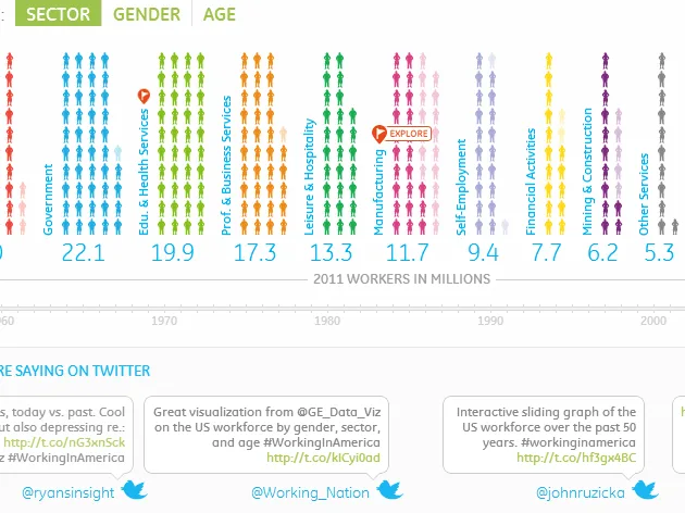
Undoubtedly the most successful of the three comes from General Electric (GE), and features 50 years of data on employment in the United States.
Entitled Who’s Been Working in America?, the application contains an impressive amount of data served by a smooth navigation and clear viewing choices. The application has been designed to serve the information and content, an aspect often lacking in infographics and dataviz where making an aesthetic impact on the user is often the most important goal.
For example, a small orange flag indicates the “points of interest” amongst the data, and gives meaning to the long series of figures. Similarly, three modes of graphic representation are used to represent the data by sector, age and gender: silhouette, histogram and square. A timeline allows the user to consult the data from each year. The employment growth rate, average household income, and the cost of a new home provide the economic context of the time.
For 2011, a new tab called “View GE Perspective” appears next to “What the economy looked like” presenting General Electric’s efforts regarding jobs. It serves as a gentle reminder that the visualisation – and for that matter all the projects published on GE’s Visualization blog – are designed by a company, and so are a form of PR.

Working in America
Food, humour, Twitter
The second application, FoodMood is more ambivalent. While interesting as a concept, the execution leaves something to be desired in terms of ergonomics and navigation. The project aims to identify and represent the link between food and emotions. What emotion (joy, satisfaction, disgust …) draws us to a cheeseburger or a strawberry cheesecake? Do these same feelings exist in neighbouring countries?
Affect Lab (a multidisciplinary team of researchers, designers and computer scientists behind the project) decided to scrape any tweets referring to food and then, based on research from Stanford University, to assign “emotions” to these tweets.
In real time, and going back to as far as April 2011, the user can select countries (or predefined groups of countries, such as “the richest countries”). The research results are then displayed as a treemap of the most tweeted foods. The box is coloured according to the emotion associated with the food in that tweet. When the user hovers over the name of each country, a well executed data-sheet appears showing national obesity levels, GDP, etc.. all in symbols. The navigation performs less well, however, when attempting to dig a little deeper into the data - it’s impossible to return to the general results of previously selected countries.

Food Mood
Where is my train ?
Developed by Cédric Esnault and Vincent De Oliveira, WIMT displays in “semi-real” time trains on the French rail network. According to the site, the data is in “semi-real” time “because the official data on the real-time position [of trains] is not available, and is kept by RATP. That’s why [our] schedules are based on the theoretical time that a train passes through a station“.

Wimt
Water in my coffee
The application Imagine All the Water, created by the European Commission, is a collection of small clickable squares, summarising the issue of our “water footprint”, using some everyday examples. How many gallons of water are needed to produce a hamburger, a t-shirt or even a pint of beer?
We learn that coffee requires 132 litres of water per cup, so the European Commission exhorts us to “replace coffee with tea, which represents a much smaller water footprint“. It’s much better for you too…

Imagine All The Water
Civil Code
Jacques Verrier, a French computer science student, has produced with the help of Gephi and sigma.js a data visualisation of the French Civil Code.
Those articles which have been particularly heavily amended over time, or refer to a large number of other articles, are displayed. Articles about French nationality or divorce, for example, are some of the most visible “nodes”.

Code Civil
Old but Gold
After all those interactive applications, here’s a link that will give your fingers a rest – and put your eyes to work instead. Yes, we know, this blog post is from December 2009. All the same, there’s no harm in diving into these 30 beautiful examples of infographics one more time. While some were well publicised at the time – such as David McCandless’ representation of the difference between right and left – others might be less familiar, such as the visualisation of wine-producing countries as a bunch of grapes (by the Brazilian designer Alexandre Suannes) or the one on the state of the Internet in Africa (Infostate of Africa).


An Infographic For All Seasons
Tired of not knowing when to eat tomatoes, spinach or oranges? These lovely posters by Chasing Delicious, a great site full of recipes and culinary infographics, will teach you about the right seasons to sample fruits and vegetables, and thus to eat more responsibly. And they should probably adorn the kitchen of any self-respecting data-journalist.

Chasing Delicious
A happy data-week to all!
Find previous editions of The Week In Data on Owni.eu
Follow OWNI’s elite data squadron on Twitter: @pdatha, @geekelle, @mariecoussin, @juliengoetz & @nicolaspatte
💬 Discussion
No comments yet. Be the first to comment!