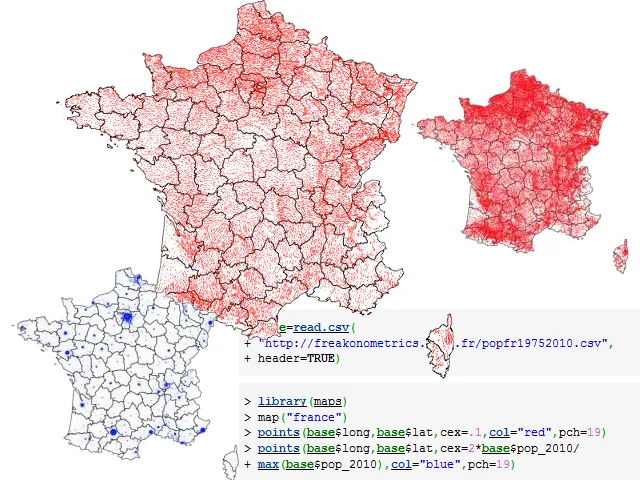
We start this week with a dataset. Not necessarily astonishing or eye-melting, but awfully useful. This CSV file contains 24 MB of GPS coordinates for 36,000 French communes (API Google Maps and GeoHack), as well as population figures for each between 1975 and 2010 (based on data from INSEE, the French National Institute of Statistics and Economic Studies). A big thank you to Arthur Charpentier – best known (although surely not well enough) for his blog Freakonometrics – and Ewen Gallic, a young French student in Montreal who passed this on. Now, over to you budding data journalists!

While we’re on the subject of demographics, this week we also took note of the “augmentation” – six years later – of a piece of data journalism carried out by Harvard University’s Amitabh Chandra. It was originally published by The New York Times in 2006 as a slightly austere HTML table entitled How Common Is Your Birthday?, based on the number of American babies born between 1973 and 1999. From that we learned that September 16 is the most common American birthday. This initial rough job was recently revived by NPR data journalist Matt Stiles as a slightly sexier visualisation. That static visualisation, frozen in Illustrator, was in turn itself revamped by Andy Kriebel, #dataviz specialist, who introduced a little interactivity using the celebrated Tableau platform. All of which makes for the compelling end product.

Arthur Charpentier (who else) has also let us know that Freakonometrics recently created a French version.
Mamma Mia
Living god of data visualisation David McCandless casts an eye upon humanity with the soberly entitled Chicks Rule? (Gender Balance on Social Networking Sites). Thanks to the research of Dan Hampson, and with the help of Piero Zagami and Tatjana Dubovina, it displays at a glance the fact that girls are more present than guys on Facebook, Twitter, Instagram and Pinterest (to name just the most popular networks). The reverse is true on Spotify, Google+, Flickr and YouTube. In all, almost 100 million new users each month connect to social networks, most seemingly for communicating rather than consuming. But that’s a personal interpretation, everyone can poke around the source to figure out their own.

Crisis, what crisis…
Trade in stores is unwavering in Italy despite the gloom, thanks notably to non-EU foreigners. A fetching infographic by the duty-free store operator Global Blue illustrates that fact. In truth, it wasn’t the subject or the data that caught our attention, but the original and polished layout. Go fullscreen when checking it out.

In the wind
Staying with data visualisation: some work based on open data, including data collected from the National Oceanic and Atmospheric Administration (NOAA) via the data.gov portal. John Nelson, a user experience specialist, categorised data tracking tornadoes according to their position on the Fujita Scale. The more powerful the tornado, the greater its impact on the map. A histogram also displays the number of victims in the form of a timeline. The project would have been perfect had it been even a little interactive, but we’ll just have to content ourselves with the magnificent image.

In the water
Anyone clued in to questions posed by the management and use of water will no doubt study with satisfaction the new infographic Which Nations Consume the Most Water? spotted via FlowingData. It’s based on data extracted by Arjen Hoekstra and Mesfin Mekonnen of the University of Twente in Holland. From that data Jen Christiansen, art director and illustrator for Scientific American Magazine, created this colourful visualisation which highlights that while abundant population may be the main factor in the vagaries of water consumption, inefficient agriculture and excessive use uring food production (30% of US water use comes from the consumption of meat) are also fatal influences.

Reflections
Finally, three posts to take note of – and that we will probably soon have the opportunity to talk at greater length about:
- ‘Crowdsourced crisis mapping: how it works and why it matters’, which provides an overview of crisis mapping and use of crowdsourcing, notably for the project Crowdmap.
- ‘Data journalism research at Columbia aims to close data science skills gap’, in which the former director of digital content at the Guardian, Emily Bell, analyses the progress of data journalism and the necessary evolution of scientific training in the field.
- ‘Anyone can do it. Data journalism is the new punk’, where the aforementioned Guardian’s current head of data offers his vision of being a data journalist, comparing it to the punk movement. While the idea is fun, the foundation for his argument is far more serious than it seems.
Of course, for some people, this will never be journalism. But then, who cares? While they’re worrying about the definitions, the rest of us can just get on with it.
A great data-week to all then, until next time.
Find previous editions of The Week In Data on Owni.eu
Follow OWNI’s elite data squadron on Twitter: @pdatha, @mariecoussin, @juliengoetz & @nicolaspatte
💬 Discussion
No comments yet. Be the first to comment!