Let’s kick off with our absolute favorite find of the week. Telling the story of the colonial empires, from their formation to their fall, this visualization is based on a simple principle.
Two years ago, designer Pedro Miguel Cruz set out to visualize the decline of maritime empires. He soon realized that the power of these empires was related to their territorial surface expansion. This approach might seem a bit reductive, but he’s managed to encapsulate more than two centuries of colonial history in a visual way. The arbitrary choice to represent the four largest European colonial powers – France, Britain, Portugal and Spain – brings a pleasing clarity to the project. The main source for their data is Wikipedia, but Cruz has said that his primary intention is to offer an “entertaining narrative”. Something he has certainly managed to achieve.
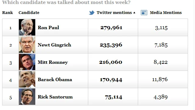
MentionMachine and the race for the White House

Last week the Washington Post released a tool for measuring the relative health of the digital campaigns of those running to be president of the United States. Each week the leading candidates are announced, according to two criteria: the number of references to the candidate on Twitter and in the media. By clicking on each candidate, we can see the increase or decrease in the number of tweets mentioning them. It’s a nice way to take the temperature of the popularity of the candidates amongst the tweeting classes.
Tweet your candidate

The French twittersphere also knows how to make its presence felt in a presidential campaign. It’s obvious the authors of this application – Aurélien Painchaud, Gaëtan Duchateau and Florent Guerlain – have no pretensions about revolutionizing the debating world. Nevertheless, the platform allows interested parties to ask questions directly to candidates related to specific issues and manifesto promises. It cuts out the middle man and offers a useful overview of the positions of each candidate on specific topics.
The wood from the trees

Two American researchers, Josef Kellnforder and Wayne Walker of the Woods Hole Research Center (WHRC), worked with the National Forest Authority and USDA Forest Service Forest Inventory and Analysis data to develop a complete inventory of the state of the lungs of the US. After six years of research, they have created a map that identifies the concentration of biomass and organic carbon present in the structure of the trees. This process of information gathering has allowed them to compile important data sets and build this comprehensive map. The result is impressive.
A treemap of the 1%

Here’s a bright idea to help us understand the distribution of wealth in the United States among the members of the now famous 1%. The New York Times’ Research and Development Lab (NYTLabs), which is right on the money in data journalism matters these days, has illustrated the variety of occupations that make up this famous 1% using a treemap. Users can explore the most lucrative professions in the United States. Not surprisingly, the category that includes the largest number of professionals on a high salary is managers, with a total of 376,076 members in various fields such as construction, banking and hospitals. The project provides a snapshot that allows the user to explore the diversity of status in economically rich American society.
I’ve got rhizome, I’ve got music…
How can philosophy influence data visualization? The designer and programmer Christopher Warnow has built a web application based on the concept of the ‘rhizome’, developed by the philosopher Gilles Deleuze in his book Capitalism and Schizophrenia. Deleuze argues that an organization does not necessarily have to be structured hierarchically, but that each element that makes up that organization can affect each other element. Warnow’s web application illustrates the relationships between people who buy philosophical books on Amazon. The result is striking and shows how the work of a philosopher can give rise to bright ideas in the field of data. We want more.
A very good data-week to all!
________________________________________________________________________________________
Find previous editions of The Week In Data!
Follow OWNI’s elite data squadron on Twitter: @pdatha, @gregoirenormand, @mariecoussin, @juliengoetz & @nicolaspatte
💬 Discussion
No comments yet. Be the first to comment!