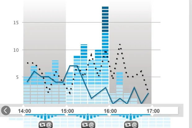
We begin our weekly data digest with an innovation dreamt up by Radio France and brought to fruition by FaberNovel. Console Twitter is a platform that allows the user to monitor the total Twitter activity of the Radio France group, including all of its various branches (France Inter, France Info, France Culture, France Bleu, le Mouv, France Musique and FIP). Primarily a tool for Radio France journalists themselves, the platform has been made open to the public. We can follow tweets in real time, track overall “noise”, mentions, retweets and so on. The buttons to the right of the dashboard make navigation fluid, while the glossary provided (click the book symbol) means the whole project is accessible even to those less familiar with the world of Twitter.

MONEY 2012
Two projects now which focus on the fast approaching US presidential election, one of the topics that’s already begun to dominate the Autumn/Winter 2012 news cycles.
The first is the Wall Street Journal’s gigantic and fascinating Political Moneyball. This enormous graphic identifies relationships between the various sources of funding for the candidates. Each circle represents a committee, a party or a donor (businesses, groups, associations, etc.). You can click through the graph or carry out a search based on specific criteria. The data comes from the Federal Election Commission (FEC) in the US.

Graphically a little more traditional, but unusual at base, the Amazon Election Heat Map 2012 represents the political colour of American states in terms of the proportion of “blue” (Democrat) or “red” (Republican) books purchased by their inhabitants on Amazon. What constitutes a “blue” or “red” book is determined by the Amazon team, who also state that:
Just remember, books aren’t votes, so a map of book purchases may reflect curiosity as much as commitment, but we hope our 2012 Election Heat Map will provide one way to follow the changing political conversation across the country during this election season.

Blood on the streets
Chicago Crime, the 2005 project of Adrian Holovaty identifying data on crimes in Chicago on Google Maps, was one of the first data journalism projects in the sense that we understand the field now. Crime data continues to feed many data journalism projects, as we showed you last week with the Wall Street Journal’s application Murder in America.
The New York Times has taken up the issue with the publication of homicide data for New York City between 2003 and 2011. Filters allow the user to search by month and hour of the day; race/ ethnicity; sex; age; weapon used and neighbourhood. The article that goes with the application is also very informative: in 2011, the deadliest months were September (52 dead) and August (51). The number of murders is also decreasing, having reached its highest level in the 60’s. You’re also less likely to be a victim if you’re a woman. There’s a lot more data analysis besides, which serves as a reminder of the necessity of explaining the data one presents.

Guatemalan journalist Claudia Méndez Arriaza embarked on a similar project for Guatemala City. Each point on the map corresponds to a homicide and, where the data exists, the victim’s name, profession and the weapon used. In a country where the rate of intentional homicides has reached 35 per 100,000 (according to data from the United Nations Office on Drugs and Crime), this approach takes on another dimension: that of denunciation. The author explains more about the project in an interview for the Knight Centre for Journalism in the Americas.

Ich bin ein data-geek
Another great classic of the data visualisation, but one in which there remain many avenues to explore: the graphical representation of budgets. This visualisation, produced by the German Ministry of Finance, presents the federal budget. If like us you don’t speak German, it shouldn’t stop you from enjoying this dataviz. Google Translate will translate the key words, and you can still enjoy the ability to browse from the general to the specific – Expenditure / Ministry of Social Affairs / etc – the clear distribution graphs and the detailed list of activities undertaken with public money. Danke Bundesministerium des Finanzen.

Time-travelling
After all those serious links, we suggest you take a look at Stanford University’s Orbis project. Orbis offers pretty much the same service as Mappy or ViaMichelin: calculate a route within Europe from point A to point B. You can choose your mode of transportation: on foot, by horse, mule or camel caravan. Yes, because Orbis calculates your route according to nearly 1,900-year-old data, from the time of the Roman Empire. So if you wanted to make a trip from Paris to Istanbul (sorry, Lutetia to Constantinopolis) in an ox cart, in September, it would take you 59.9 days to travel the 7488 km.

The Age of Creativity
The application How Old Were They? comes from an amazing thought: Is there a prime age for creativity? And if so, is it the same for novelists, musicians or film directors? If the list of lucky ones may seem short, the idea is interesting and the execution is fluid and aesthetic.

Some more data-related links this week:
- An interview with Nigel Holmes, specialist in “explanation graphics”, longtime Time magazine contributor and creator of the infographic It’s the Economy, Stupid!

- The list of finalists for the “Information Is Beautiful Awards”
- The World Bank’s dataviz Tumblr, which lists the achievements made from their data: a real gold mine to compare different visualization techniques and the multitude of projects that can be created with the same data sets.

Find previous editions of The Week In Data on Owni.eu
Follow Owni’s elite data squadron: Twitter | Facebook | Pinterest
💬 Discussion
No comments yet. Be the first to comment!