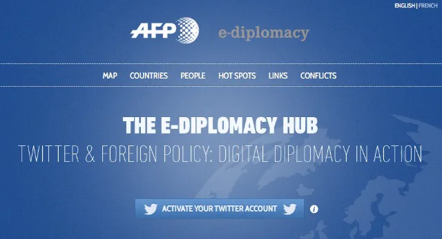
Let’s start this latest episode of The Week In Data in diplomatic fashion. Last week AFP launched a new interactive application The E-Diplomacy Hub — Twitter and Foreign Policy: Digital Democracy in Action. It’s extremely rich in content and fairly complex stuff, and much like the subject it explores the application merits more than a few seconds of attention to get the full benefit of its potential.
Public diplomatic actors are the starting point for the application. AFP has selected 4,000 Twitter accounts (personalities and/or organisations) who they consider to practise some form of digital diplomacy. Heads of state, diplomats and ministers are present, of course, but also lobbyists, experts, activists and hackers.
AFP’s algorithm takes into account tweets, number of followers, percentage of retweets, the level of interaction and ratios between these indices, in order to rank the accounts in order of influence.

To study the relationships between these actors and their significance and impact in terms of foreign policy, the application offers several novel methods to skin the same cat.
- The “Map” function allows the user to visualise the digital and diplomatic relations between two states of your choice, and to consult the most popular hashtags. This feature is a bit difficult to understand: when you select two countries, then click on the icon of one of the two, it’s that country’s Twitter exchanges with every other country that’s displayed, not just the exchanges with the other selected country.
- The “People” and “Countries” functions display the ranking of influence. It is possible to enable filters, and compare the evolution of influence for the selected accounts.
- The “Hot Spots” function is perhaps the simplest and most effective: select a hashtag amongst those most used, and choose up to three countries to see what the actors in these countries have to say about these hashtags.
- The “Links” section displays the people who follow or are followed by a particular account.
- Finally the “Conflicts” section highlights some conflicts that have been heavily discussed on Twitter.

No wonder then that this application is complex: it maps for the first time a new ecosystem, that of digital diplomacy, and makes the data collected available to all. This is a great tool: the influence rankings will be updated regularly, similarly the trending hashtags. AFP also says it will announce at the end of each year the top 100 most influential countries and people in the world of “e-diplomacy”.
A tip of the hat then to the concept and execution (particularly to our old friends Pierre Romera of Journalism++ and Elsa Secco).
Meanwhile, in Greece
This interactive graphic produced by Igraphics, a site established by Greek journalists and designers, is very successful. In an understated manner it gathers together in a single place a variety of election data: mapping results, the colour of the new assembly, the percentage of votes, etc..

The Data Olympics
2012 has been dominated by political events so far, but this is a big sporting year too. After Roland Garros and Euro 2012, the Olympics are on their way. These events are all extremely conducive to being redrawn in data visualisations. Visualizing.org, a community of designers, developers and journalists created and hosted by General Electrics, has even launched a contest for the occasion. Open until July 27, it will reward the best dataviz’s on the Olympics that meet the criteria of “understanding” (10 points), “originality” (5 points) and “style” (5 points).
For any potential participants, here’s some inspiration: The New York Times’ Map of Olympic Medals, all the more impressive in that it dates from 2008; or the visualisation on the revenues generated by the Olympics for NBC since 1984.

Bourdieu, data journalist
This achievement is more anecdotal but nonetheless reveals how data is everywhere, and has been for a long time, and how today’s tools and techniques allow us to renew yesterday’s ideas.
In his book Distinction: A Social Critique of the Judgement of Taste published in 1979, the sociologist Pierre Bourdieu published a graph representing the four main food choices and how people feed themselves according to the allocation of economic and cultural capital, as well as free time and status of women.

Molly Watson, of the site Gastronomica, has redesigned the graph, removing some elements from it (the issue of free time and status of women) and adding foods or behaviours typical of the 21st century (“DIY”, “macchiato” “microwaveable foods”). Watson doesn’t claim any great ambitions for the project other than to amuse herself, opening the discussion – “This graph is but a starting point. What would you include?“. But the result is nice and opens up some perspectives between data and sociology.

Colour by Numbers
Do you find it hard to choose what to wear every morning? What’s the in colour, what’s out of fashion? The Pimkie brand, in a completely selfless move, has set up a project to help. The “Pimkie Color Forecast” has placed cameras identifying the most worn colours on the streets of three fashion capitals: Paris, Milan and Antwerp. From these observations, they’ve taken a series of data displayed in the form of pie charts and histograms, enabling Pimkie to advise you on the correct colour to wear.

Remembering Rio
From June 20 to 22, Rio played host to the UN conference on Sustainable Development, 20 years after its last edition. Criticism of its organisation or the involvement of industry lobbyists has tended to make the news more than the agreements and commitments that have emerged. The French Ministry of Foreign Affairs and Netscouade have taken the opportunity to produce a beautiful interactive application (French), telling, from 1972 to 2012, the Odyssey of Sustainable Development. Scroll, click, navigate, it looks cool and is very informative.

Have a great week everyone.
Find previous editions of The Week In Data on Owni.eu
Follow OWNI’s elite data squadron on Twitter: @pdatha, @mariecoussin, @juliengoetz & @nicolaspatte
💬 Discussion
No comments yet. Be the first to comment!